seemly
Well-known member
- Joined
- Jul 8, 2024
- Posts
- 314
- Reaction score
- 490
- Trophy points
- 64
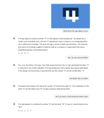
The visual hierarchy here dictates M4, which clearly isn't quite right.
Certainly heading a decent direction, though.
The visual hierarchy here dictates M4, which clearly isn't quite right.
I don't disagree, I thought this could be alleviated by using a more dominating colour fill for the 4. How would you suggest an improvement?The visual hierarchy here dictates M4, which clearly isn't quite right.
Certainly heading a decent direction, though.
I've heard the crack pipe and a cherry coke is one of the best "stacks" you can have for concentrating on workHaha. I prefer the crack pipe at this hour. Cherry coke later.
Hopefully it's not full fat coke...
Ah, nootropics. A man of culture.I've heard the crack pipe and a cherry coke is one of the best "stacks" you can have for concentrating on work
I am a fan of
Love this one! ... something fishy about it .. but i love it

")

No but that is a beautiful logo, wish I’d have thought of itout of interest, was it inspired by this one from 4mgroup.co.uk ?
View attachment 33
it's quite good for the architects, but for the forum and overall higher appeal - yours is just great


I can see why they call you Tricky!