There are two most liked candidates at the moment and I believe community should decide between those two (still time to submit more ideas and become immediate favourite ;)
View attachment 82
This logo is simple but original. Feels light and cybernetic. Although, as someone mentioned it has uncanny reminiscence of a fish skeleton, which seems to stick once you recognise it =) as we hope this forum will float and sail, the fish remains connotation might be a bit haunting, even for those of us who aren't superstitious.
Also it's a bit too long. Ideally a logo would be more squarish to be easier adjusted for icons/favicons.
I propose to drop "uk" part before it goes for the vote.
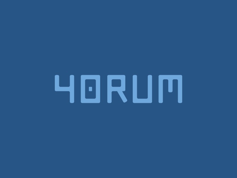
View attachment 81
This one is more bold and straight to the point. I don't see that it reads as "m4", for me "4" is clearly on the foreground and it's a definite "4m".
Immediately usable as favicon and easily blends with the content whenever placed.
Great as is, but I'd ask Ben to play a bit more with colors/shades/contrast to see if nothing can be improved.


www.logoai.com


.png")
